

Johnny
-
Content Count
2,122 -
Joined
-
Last visited
Posts posted by Johnny
-
-
I already told you about the work it needs.(Dentist series though?)
-
Hm...okay....looks alright this time, but the render's a little TOO blended. The bg is pretty chaotic (which isn't bad, really) so the render is pretty hard to see...try giving it a little saturation back.Also, the text is blended now, but the white gradient kinda "disturbs" it. Try just adding a drop shadow and a white or black stroke at about half opacity...just play around with settings till it blends a little more nicely.But, aside from my obsessive nitpicking, it looks good. You're gettin' better Luki. ^-^
-
What he said. Also, try some blending with your text. I mean, similar colors is nice, but maybe try lowering the opacity so some of the bg seeps through, or even just brushing over the text. It doesn't seem like that much of a difference, but it is, trust me.Other than that, and what HmmZ said, nice job Luki. Keep at it.EDIT: Also, border. I don't see one on there.
-
Looks a little better, just maybe a little dark...i'm not sure if there's more there, but I definitely can't see much.I've been messing around some more with photoshop. I've gotten some pretty cool results;
Practice9
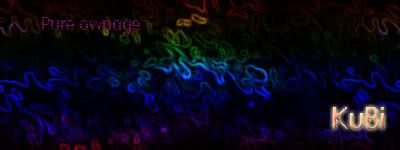
I added gradients, wind effects and blending to my text. I'm not sure if the text looks correct yet, I'm still trying to work with that. I know "Pure Ownage" is hard to read, I made it like that, so it doesn't "stick out" to much.
Comments?
And about before, I know you need someplace to start. Everyone does. I did. I started off very similarly, actually. Just accumulate techniques, and more importantly, accumulate knowledge about Photoshop. Photoshop itself is a VERY complex program. The more you know how to do with it, the better stuff you can -produce- with it, you know?
Anyway, keep trying. You'll get better with time, I guarantee it.
-
Kay, I'll try to help out as much as I can...1. -- Look up some brushing tutorials...sounds like you have a nice selection of brushes, just not the technique.2. -- Avoid choppy renders. You can find some nice clean-cut ones with transparent backgrounds at gamerenders.com and a number of other render sites.3. -- Um...what's the deal with the text? It looks like you used a dissolve mode on it...it looks pretty bad...4. -- The Senor Maniac text in the bottom could also be a better font. I suggest a pixel font, like Squarehead10, with a little more blending.5. -- Try not to set the background one single color. As I said before, use brushing, and also try making several color balance layers with the Clouds filter on them, so the sig is multicolored.6. -- When resizing the render, make sure the heighth and width are linked together (there's a chain icon) so it's equally proportioned.7. -- Borders are your friend.I think I covered most of it...sorry if I sound rude, just trying to point some essentials out. Keep trying though. You'll get better with time.
-
Luki, you still have to post it in the right forum...If everyone used that logic, we'd all just post in the general forum, because that's what gets the most views.Anyway, they look okay, but the last one is really the only one that looks "good". Try to continue with depth.Also, those might look a little better with shadowed lighting and materials. Try it out.
-
Off-Topic//Legally, photoshop is not free, and by calling people idiots, you might spark up a flame war.\\Off-Topic
I'm mainly just gonna reiterate what most others have said. Color the text to a color that matches [bluish-Purple, blue to match the background or purple to match the render] and try different methods of blending in the render. It looks like you went around the edges with a grunge eraser. Try setting a higher opacity for the eraser, or using the feathered-lasso technique.
I use feathered lasso, or just brush over the render...those methods seem to work best, but that's just my personal opinion.MechVegita, you've been warned for flaming. This has been your 4th warning. I'd suggest you change your attitude towards other members, especially when you are, in fact, wrong. Photoshop isn't free.
-
-
Heh, thanks, glad you like it.WOW, great sig

Johnny, I need 3 logos (for the top of IPB board and to use on 3 websites. Would you be interested in doing them? If you have PayPal I'll even pay you for the logos.
It's not as tech as the ones you have made before but If you are interested I'll give you the parameters.
Nils
I could probably spare some time to help you out Nils. Just pm me the info and I'll try to get to it sometime soon. I have Paypal, but payment's not really necessary...I give sigs out for free every day, and this is pretty much the same thing, so I don't need to recieve anything now.
-
Seems like you're just following tutorials, which is good, but try to get a little more familiar with Photoshop, so instead of just mimicing tutorials, you can modify the techniques you learn from them and add in some of your own flavor to produce a better looking sig.I just recently was playing around in Photoshop, and learned how to do some interesting vector shapes, so I added those to my previous knowledge and my sigs are even better (like the one in my sig, or Cool Freakers, or HmmZ. I made all those.). It's about bringing more to the table, not just taking what's already there.But, that said, nice attempts for a beginner. Keep trying.
-
I think it looks pretty good...the only things I can point out is that the color on the render should blend slightly more with the bg, and the text could use some work. Try a more "tech" font, and without the bevel.
-
Hm....a little better mat, but I'd say avoid animation at this stage in the game. Even I don't think my animation is up to par, so I usually avoid it...
-
-
^-^ I had the same problem. I've gotten 3ds max, cinema 4d, illustrator, painter, bryce, photoshop, and a bunch of others...I only use c4d and photoshop now, because those seem best, but I don't do my 3d stuff as much as I used to, because every time I look around people are making stuff SO much better than mine... X.x
-
Looks nice Luki. A lot better than my first tries in C4d...
-
Hm...if you don't mind guys, I could also give it a shot...it'd have to wait a little while, but I'd like to try it out.
-
-
Suggestions duly noted. Thanks Phyre.
-
Haha, I know, it's just that Saint Mike seems to love red, and it didn't really look right with any other colors mixed in...thanks though.
-
-
You can't make games with it. X.x
You can make CHARACTER designs, maybe, but that would take months of practice first.
It's for modeling though, definitely not game developing.
-
What he said, and choose better colors. A dark black and blue sig would work much more nicely with lightning bolts than FIRE.Not bad, though 244kb is quite big considering the simple animation. If you look up some tutorials, I'm sure there's ways to have several bolts of lightning come down at different times giving it a more random feel.
I would recommend a border - it can be simply a 1 px black line, but it helps to define the edges, and gives it more of a finished look. Try some fancier fonts also, if you don't have any go to Dafont. Perhaps make the lightning bigger, or get a render in there to fill in the space, as the background itself doesn't have enough contrast to stand on its own without another feature. Good work though, it has definitely improved greatly
-
Okay guys, I just got back from the DeviantArt Summit, and it was frickin rad. I already posted everything on my Myspace, and I don't feel like posting it all again, or copy-pasting, so just go here and read all about it. It was awesome.
blog.myspace.com/johnnyboywonder/ Also, if any of you have Myspace, you can try to add me, but I'm not guaranteeing that you meet the required coolicity levels.
-
Ooh, psionics. Even better. Lemme know if you find that link, but send it in a pm or an im.Not really Cyborgnetics, but psionics. The vectors can only work if they are not in severe pain. Like you'll see a few sections of the series were one of them gets shot and they can't even call the vectors to help them.
Yeah...if I could find the site I got it fround I'd post it here for you to go download the series....hmm...

Ps Template Help i got a question
in General Discussion
Posted · Report reply