

samma
-
Content Count
89 -
Joined
-
Last visited
Posts posted by samma
-
-
sure ill vs you... ill post my render soon
-
heh sorry sprite... thats just my opinion, anyways with the 2 new ones u did for the 1st one you need to fix up that text and with the 2nd one i think the text mode is on overlay/softlight... leave it on normal, trust me it will look much better
 the brushing is getting much better in the 2nd one too
 -
id have to agree with snlildude... The brushing is faint and it looks like you blurred it for no good reason, the background needs color the render needs to be blended, the text doesnt suit the sig and its a jpg... popout sigs MUST be either in gif (low quality) or png which is only transparent in firefox but i think they would still get the point.Im not going to rate this sig...
-
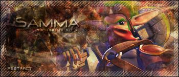
heh well here is my submission... hope its absract enough
-
well ill be helping you when i can... but my advice right now is dont use the same brushes for each of your sigs... it looks stupid some times and dont use the TOO popular brushes... aka Metal-CX's brushes because most of the time the sigs turn out to be looking like some1 elses in another forum... trust me ive used Metal-CX's brushes b4
-
even though you kinda hid the text a bit its probally the best looking one to me... the last 2 look the worst to me
, in the 2nd last one the boxes kinda cover the render... thats not what the boxes are for. In the last one I feel that you "overdid" the scan lines, I dont like the text either and the brushing looks a bit weak to me...#1 7.5/10#2 7/10#3 8.5/10#4 6/10#5 6/10all together... around 7/10btw truefusion is right... if you are going to make the boxes they should be evenly distributed -
lol yeah i kinda over did the border >.< anyways...i was always told to blend the render in now... im getting told to make the render stand out
-
heh lol np i cant really choose texts
 gotta master that soon lol... anyways who voted for the 1st one?
btw ive got a new clone stamp and i would like it rated + commented and etc
http://forums.xisto.com/topic/27958-another-clone-stamp-samma/
btw the one that is for makka is my 2nd one so heh im getting good at clone stamping
-
heh i made this one for some dude in tp who has paint shop pro... >.< paint shop pro cant make good stuff
... anyways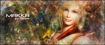
plz rate + comment, btw the text doesnt really look good because i didnt put much effort into it... well like no effort really, i was kinda really wanting to make a nice bg for him
well... at least no one can comment about it being monotone
-
what part of the tut dont you understand? lol i thought i made it as easy to understand as possible...
o well im glad people think this way of making bgs is neat, but it kinda needs brushing now -
clone stamp duplicates specified parts of renders using brush features
... note this wasnt my idea, i was made it from a vid sig tut -
#V1
#V2
plz rate + comment
-
mayank gmv, popout sigs arnt what i would have seen in tournaments, and seeing that I think he rendered that himself... he should get the extra credit, i like the text althought it stands out too much.Bluhapp: 2TrueFusion: 3SarCasM: 0mayank: 1Rejected: 1samma: 3Moody: 0SnXster: 1
-
this wasnt a pixel stretch, it was a motion blur with a few color-cloud layers
, and the modification wasnt shadow, it was a heap of glas blurs on overlay and normal , btw i thought the text was bright enough... anyways thx 4 the comments -
my first popout sig, if you are wondering why the render looks retarded as the outlines... think again
Before :
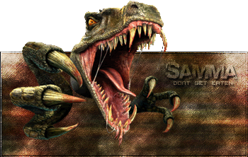
After (Note this is a png, invisibility of the bits are only in firefox) :

OR the low quality version that is invisible even in ie

plz rate + comment
-
heh most people complain about the render
, anyways yeah i should of picked a better font -
this is the sig i put for Saints Tournament
, plz rate + commentI kinda like it and because people have been complaining, i have put brushing in it, it is visible but the layer modes are on overlay + softlight so its kinda harder to see
-
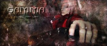
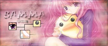
lol sorry for being late, havent been on for like ages
, heh here is my submissionSamma[IMG]http://img.photobucket.com/albums/v476/samma383/Samma-Speed.jpg[/IMG]
GL all
-
it should be in the pack i gave you, lol go down to the bottom and check the letter v
-
the pixel font i use is vistor 2bk or something along those lines, make sure the *aa* mode is on none to make it look nice and strong
-
well... this is my first starwars sig... i hate starwars just like i hate stuff like harry potter. Anyways, this was for a SOTW in a different forum, i kinda like it lol even though i hate starwars...
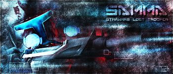
plz rate + comment
-
well... you should use photoshop, btw i can get photoshop 4 u dudes for free ^^ if the admin lets me post the link of course, if not just add me on msn and ill teach u how to
-
heh nah its cool, its completely different to sigs that i normally see.... so i guess its a filters sig and thatz pretty good.thx

-
ouch, that sounds painful, but with the sig, good job.I kinda dont like how its a bit monotone but the brushing looks good and the little tech you put in there was awsome.
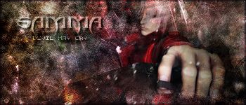
![http://img.photobucket.com/albums/v476/samma383/Samma-Speed.jpg[/IMG]](http://img.photobucket.com/albums/v476/samma383/Samma-Speed.jpg%5B/IMG%5D)
Stone Cold 3:16 Vs ?
in Graphics, Design & Animation
Posted · Report reply
woops... i meant sig, can a mod delete my post above? thx
this is my submission