

samma
-
Content Count
89 -
Joined
-
Last visited
Posts posted by samma
-
-
heh good job, lol ive never made a popout sig b4, lol i think they look weird
 .Try to get better fonts, brushes and maybe make it not as monotone.
 -
heh this is a simple and understandable tut, at first i started using the filters but i was advised by my gfx friends to get brushes
. I must say though your tut was detailed but... you could of put in more filters to make it look better and maybe add a bit of contrast in it to give it a good lively feel. Good job though -
awsome render lol i might use that later, btw did you use the pen tool to render it or the magnetic laso? lol i have troubles with both
, the pen tool like isnt erasable and the magnetic laso always sticks to the wrong place (well sometimes). -
they are pretty old lol but... at least you gave me my old time flash website
i forgot it lol and i hadnt found it til now . The good ones are really the ones made by WX (de_dust, de_aztec and etc), another thing, he is making a de_dust2 which will be awsome lol, heh cant wait 
-
as funny as it may seem, i like it, the render is nice and simple, you used my border type i think
, good job with it.The only thing i would reccomend is getting better brushes and better fonts. -
i use gmail, it was really good at the start but it was kinda hard getting invites, but now that it is gonna become non-invitational and any1 can join, its gonna be easier to join.gmail is my fav, btw what is GMX?
-
heh thanks everybody, considering all of you guys love my techniques, should i give a tut on how to make sigs like the ones i made just then (note you need a render and it is done by motion blur
) -
good attempt for a 2nd sig but you should of lowered the opacity of the scan lines and maybe put the layer mode on either overlay/soft light.my recomendation is d/ling brushes, i would recomend getting saint micheals though, my friend d/ld a 300 mb brush pack (mega) and his list was full and he was only up to c (1027 x 728 or w/e it is), you should also get fonts and some forums have font packs that should be around 20 mb.you should at least have a 1 pixel stroke for a border or maybe look at my border tut
.With the render i dont understand why 1 of the renders are behind the scan lines and the other one isnt.With the pixel font you should put the mode to none, this makes it so the text doesnt look blury -
well if you cant see it on the first border, maybe you need to put the border on the top layers, if you still cant see it set the layer to soft light instead.With the second border, if you cant see it you should put it above your brushing layers and work down until you get a good look.
-
heh thanks, im not that good at tech
im only really good at grunge and abstract really. -
heh thanks for inviting me to the site
http://forums.xisto.com/no_longer_exists/404.png
hope you like it, i put a little bit of tech but i didnt wanna over do it
-
lol i dunno where i found my grunge brushes, well most of my brushes really, i normally get introduced by friends into gfx forums and they usually have brush packs
My only advice for you to find grunge brushes are to go
http://www.hugedomains.com/domain_profile.cfm?d=designmeter&e=com
Or (This one is good because the fav'd ones come up)
http://www.deviantart.com/browse/all/resources/applications/psbrushes/
Or to gfx forums where they put brushes into packs. -
lol heh im gonna enter this one
, good luck everyone -
oh, yeah its free transform, lol i didnt say free transform in my tut i said Ctrl + T which is the shortcut of free transform.
-
okay no problem, find the middle of your render (well sometimes it isnt the render, but somewhere that is nice and fits from top to bottom) and use the rectangular marquee tool and get a strip around || think from top to bottom.
-
heh lol i dont really have much time
, but heh ill enter this one
-
lol i havent been here long enough to judge people, but do noobs like read a tut and try to do it before actually learning the basics of sigs? like borders, texts and etc?
-
These are my ways of cleaning up my signature
_______________
Border Type 1 : This is one of the most popular borders.
You should have a signature that something looks like this (could look competely different).

Step 1 : Make a new layer above all other layers and then select all, and do a 1 pixel black inside stroke. Stroke can be found by Edit > Stroke
Step 2 : Make a new layer above the 1 pixel black stroked layer and select all, do a 3 pixel black inside stroke, then a 2 pixel white inside stroke.
Step 3 : Turn the layer just made (in step 2) so that the settings are on overlay.
Your result should look like this
_______________
Border Type 2 : Note this must have around 5 layers of brushing at least.
You should have a signature that looks something like this (could look competely different).

Step 1 : Make a new layer above all other layers then select all, and do a 1 black inside pixel stroke. Stroke can be found by Edit > Stroke
Step 2 :Then make a new layer below some of your brushes and select all, then go to Select > Modify > Border and do a 20 pixel border, then fill it with white.
Your result should be this

_______________
-
These are my ways of cleaning up my signature

_______________
Border Type 1 : This is one of the most popular borders.
You should have a signature that something looks like this (could look competely different).
Step 1 : Make a new layer above all other layers and then select all, and do a 1 pixel black inside stroke. Stroke can be found by Edit > Stroke
Step 2 : Make a new layer above the 1 pixel black stroked layer and select all, do a 3 pixel black inside stroke, then a 2 pixel white inside stroke.
Step 3 : Turn the layer just made (in step 2) so that the settings are on overlay.
Your result should look like this
_______________
Border Type 2 : Note this must have around 5 layers of brushing at least.
You should have a signature that looks something like this (could look competely different).
Step 1 : Make a new layer above all other layers then select all, and do a 1 black inside pixel stroke. Stroke can be found by Edit > Stroke
Step 2 :Then make a new layer below some of your brushes and select all, then go to Select > Modify > Border and do a 20 pixel border, then fill it with white.
Your result should be this
_______________
-
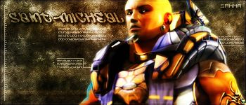
erm... first of all... saint micheal i dont think you are 20 steps higher than begginers, thats just over the top.heh pixel stretches generally need to be blended IF the render is light in color, otherwise i would recomend it staying the same.
-
this is one of my older tuts but it shows you how to blend the image

heh hope you liked my tut
-
lol well, might be a bit weird to saying i dont like the 5th one, well firstly i think its oversized (my mistake lol i did 450 instead of 350
), i am tried of seeing metal-cx's brushes on sigs lol they are like the best brushes but the most popular brushes, they are seen too often and i like a bit of variety ;)saint-micheal, what do you mean it needs more color? lol pixel stretch sigs either look like mine or have like no brushing and looks weird, lol well it kinda depends on the render -
well grunge brushes arnt hard to find, well good ones are kinda hard to find but here is an easy way to find them
, along with other good brushes
around every day they have 5 new fav'd brushes at deviant, most of the time they are good
http://www.deviantart.com/browse/all/resources/applications/psbrushes/
you can try searching for older fav'd brushes too
http://forums.xisto.com/no_longer_exists/=
heh im not really sure about this site, but before it was awsome until some of the links were broken
http://www.hugedomains.com/domain_profile.cfm?d=designmeter&e=com
Or... you can join forums like tech paradise (in my sig), allergy-ut.com and etc. Good luck on your verge to finding grunge brushes -
heh well i joined a bit late
i wouldnt mind joining this sotw, ill join the next one :)Saint Micheal GMV, its hard to choose really, as only Frozen - Sprites - Saint Micheals sigs are good quality, not that ive seen enough from each member to judge them.Saint Micheal - Awsome sig, although you should of put some multi color into your sig and maybe a little bit of tech, the green kinda gives it flow.Frozen - I would of voted you if you brushed most of the black, the sig looks a bit plain but the render placement was awsome.Sprite - You put good depth in the grunge, a bit of everything really, its an awsome sig but i think the text put you down.
Msn 7.5 MSN
in Software
Posted · Report reply
lol i cant be bothered getting off my chair to get 7.5, ive heard it isnt much better than 7, lol tell me if it is cuz 1 of my friends are like bugging me cuz of the voice clips and etc