

samma
-
Content Count
89 -
Joined
-
Last visited
Posts posted by samma
-
-
ahh dude... are u syrp?... no!!!so delete the duplicated render layer and start all over with the tut...
-
for some reason its crashed... but i wouldnt mind having a moderator position
-
the text is very bad... and you either used the motion blur or cross hatch filter to get the colors in which spoils the sig because it looks very random... the sig needs much more brushing work and there isnt much contrast in the sig... the render isnt big enough either.
If you want to make the render stand out... this is a much better way,
Step 1 - Duplicate the render
Step 2 - With the render above the original render, go Filter > Blur > Glassian Blur (or something like that) and a size of 2.4/2.8
Step 3 - With the blurred layer put it on overlay
Optional - If the render looks to dark, lower the opacity of the blurred layer.
heh hope the tut on how to make the render stand out was helpful...
-
well... first of all i think the sig is too wide... render is kinda small, text isnt too good and please use pixel fonts next time for the sub text, the brushing is alright for sparkle but id reccomend a background that isnt monotone.the border is kinda a bit think and its meant to be above the whole of your signature... id reccomend getting better fonts, checking out more tuts and getting better brushes (not brushes that are Very good and u dont know how to use... rather brushes you know how to use)
-
yeah i use the render > clouds function to start my bg when brushing... but i brush it different to other people (btw a tip is... instead of using black and white for your clouds... use black and EXACTLY THIS *aaaaaa*)heh yeah it is a diffent way to brushing but heh some people find it easier to brush this way because sometimes when you use the clouds function the colors are very unbalanced and the sig can turn out "whored"
-
heh i took a different approach this time
 >.< absract grunge
Samma[IMG]http://img.photobucket.com/albums/v476/samma383/Zelda.jpg[/IMG]
-
nah thats my 2nd oldest way of brushing... im way over that style of brushing but its good for putting depth into the sig...
-
... it is monotone... including the render, if you are using color balances... id reccomend putting clouds in them to give a multi-colored effect.
-
heh finally
 some1 actually wants to battle me

GL
-
the sig needs alot of depth, the render may need to be bigger and blended, the bg is monotone and it needs a border
-
well... to help you out, i posted my OLD sig tut that explains how to get multi colored back grounds... ive also explained how to blend the render in and etc
, its not accepted right now cuz i just posted it, but check in the graphics tut section every once in a while to check it out -
this is one of my oldest sig tuts >.< i completely forgot about it, but i kinda wanted to share it with people who are struggling with gfx

hope you like it
-
well... personally im gonna stop d/ling renders unless i just get a dvd and fill that up with renders
... anyways i dont really like VERY VERY BIG BRUSH PACKS, i used to have a 300 mb pack of brushes and that kinda filled my whole screen and that was only to like c >.< -
bad choice of render... its monotone and its got the text at the bottom >.<, i dont like the text, the bg looks really really plain with its monotone colors cheme and brushing... I dont really see a border eitherI would reccomend starting off with grunge brushes because they fill up the bg pretty fast and they look pretty good, for a render, i would reccomend a render that can fill up at least 1/2 of the sig easy, you need new fonts too...
-
well heh i kinda brushed up my ratchet and clank sig by putting different colors and putting a bit of tech in it
, im feeling confident about this one 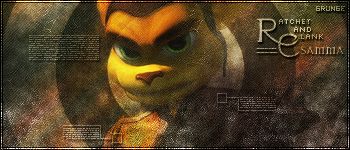
GL all

-
nice combo of brushing, but i think the only thing id suggest is a better color for the bg, i mean it looks a bit monotone, the text doesnt look too good either >.<
-
the text is above the scale lines >.<, anyways i fixed the text up

-
Max Size : 450p by 150pMin Size : 300p by 100pStyle : Grunge (Soft and/or hard)Sig Due Date : ASAPRender : AnyTheme : Anyonly post if you are going to enter, and enter your sig in at the same time... ill post my submission tomorrow when i make it
-
sweet thanks
i think its one of my best too but i think the top part where its like all black should have a bit of brushing >.< personal opinion -
heh new style for me
, well kinda , anyways i like this sig even thouhg i think i might of over grunged the bottom of the sig, well at least i got the text right this time ... i think
Plz rate + comment
-
lol i meant depth, and i think the sig is slightly over contrasted >.<
-
lol yeah thats it, i checked my other topics b4 and noticed that u guys wanted the sig tut
sorry dudes didnt check anyways if its made by Tai-Pan/audacious thats it, btw his tuts are nice so check his rep if you wanna find more of his work :huh:btw nice sig but i think it needs a bit more color tbh and id reccomend using grunge brushes good job though for your first -
er... i dunno what to say WHY IS IT SO BIG!!!
-
heh i checked the request forum again and to notice that you still havent got your sig

so... i couldnt resist to make a clone stamp sig for you
 , i also played with the border heaps and kinda did a 2 in 1 border... hope you like it
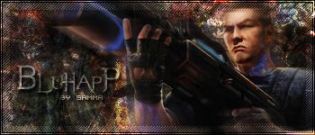
Sig for Bluhapp[IMG]http://img.photobucket.com/albums/v476/samma383/Bluhapp.jpg[/IMG]
![http://img.photobucket.com/albums/v476/samma383/Zelda.jpg[/IMG]](http://img.photobucket.com/albums/v476/samma383/Zelda.jpg%5B/IMG%5D)
![http://img.photobucket.com/albums/v476/samma383/Bluhapp.jpg[/IMG]](http://img.photobucket.com/albums/v476/samma383/Bluhapp.jpg%5B/IMG%5D)
Abstract Sig ~ Samma
in Graphics, Design & Animation
Posted · Report reply
well... i havent used metal's brushes for a while, well to tell u the truth i only used it when i was a beginner at sigs, i kinda got a new brushing technique and im seeing great results ,
,
R & C plz