

samma
-
Content Count
89 -
Joined
-
Last visited
Posts posted by samma
-
-
well... im done... i kinda bent your request size... 400 by 150 is way too big...

heh hope u like it anyways...
-
well... thats not really a smudge sig considering the strength was obviously on 20 or something
 if its on 100, blending it makes it look stupid
 -
No the sigs gone Rebel
its not Kombat its Combat (rebel) ... anyways... maybe i gotta get something through to every1 appart from SM and Truefusion... Smudged Renders don't and will never be blended... makes it look stupid 
-
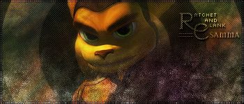
Ok... another one of my best... I think anyways
R&C plz
-
id have to agree with Cerebral... its monotone, text is really bad... the animation is stupid...
-
no its fine... the blend was deliberately blended...
-
um... i didnt use brushes...
-
(no brushes)
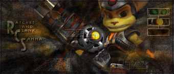
heh... R&C
-
lol yeah... i havent really been here for a while >.<
-
heh well... R&C
-
uh... bump
-
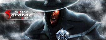
Okay well... here it is
Link
http://www.gamefront.com/downloads
Preview
its not that good... but heh its more abstract

-
saint micheal introduced me to this site
-
-- Samma --
Real Name: Sam
Age: 14
Time designing: Approx 6 months
Nationality: Australian (not aboriginal btw...)
Current Location: Sydney, Australia
Favorite Styles: Grunge, Abstract, Tech, Blurs
Favorite Fields of Designing: Sigs, renders, banners...
Programs: Adobe Photoshop/Imageready CS2 (9), Flash Pro 8
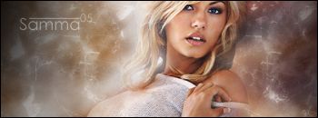
MSN: samma383@gmail.com-- Choice Sigs --
-- My Photobucket Account --
http://smg.photobucket.com/user/samma383/library/ -
heh just got on today and bam wam im in the gfx crew
GL RYO and psychiccyberfreak -
awsome... have my old sig thats up for it...
though i think reaver is gonna win this

-
-
heh ill join
-
heh i deliberately darkened it on the sides....@all, thx 4 the comments
-
heh i should get that... probally very good :Pthx every1 for the comments.
-
heh well... abstract fracantals... R&C plz
-
HEY WHERES MINE... j/k, lol the bottom one is awsome... every thing looks nice... maybe a bit more colors but its awsome, with the second one i think you put too many colors and the renders generally arnt meant to take up the whole sig...
-
its kinda like a vortex because its spring out from the middle to the sides... if you know what i mean
-
lol combining most of my skills... xD im came up with this... its slightly different to all my approaches, as u see its kinda got that vortex tech grunge look
R&C plz
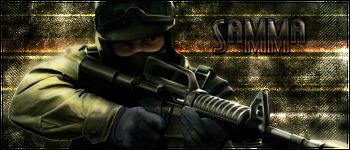
Mortal Combat Sig ~ Samma
in Graphics, Design & Animation
Posted · Report reply
maybe you dont read posts... ive already gone over that its a "C" to make it more rebel