

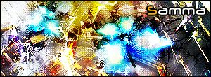
samma
-
Content Count
89 -
Joined
-
Last visited
Posts posted by samma
-
-
well im requesting the battle to him...
-
Theme: No specific theme
Style: Freestyle
Size: 300px by 100px - 450px by 150px
Render: Any
Animation: Optional
Due Date: Wednesday 26th of April
My Entry:
-
-
A little plain for me. Maybe if you spice it up and trough in a orange back ground or combine your two sigs together.
a little plain? uh... i cant really see a "good" sig from you and lets just face it... you cant make sigs... and i have no idea what ur talking about "combining" sigs together.
-
sigh... its an orange border
 and heh thx
 -
heh I had to go with JdMx... just looks the most appealing to the eye
Albus Dumbledore:0JdMxStyleZ:1
hulunes:0
Senor Maniac:0
Avalon:0
saga:0
savage17:0
Saint-Michael:3
-
heh well im back from camp
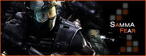
R&C (btw it wasnt clone stamp
) -
The c4d render is custom made. and that font is custom made.

Depends on your definition of custom made.
1. fonts never get counted towards it being default, 2. i made the c4d render and considering its a render... doesnt make it not a default sig.
-
There's a difference between defaults and no brushes, you know.
Anyway, they look okay, but I could probably reproduce the first one, and I don't really like the c4d (I assume it's a c4d render) in the second one.
yeah I know but considering I didn't use anything custom made it is defaults
-
um... no I haven't used brushes at all
-
um... the text is really hard to see and the size of the sig is like a bit big.
-
well... I'm back... these are my latest 2 sigs... and as usual they are default only
R&C plz
-
the size is too big... the render doesnt really fit that well... its kinda monotone, the background has way too much contrast and the text isnt that great >.<
-
I dont really like the text... the grunge is kinda unbalanced, the render doesnt fit that well and the border needs to stand out more.
-
its alright... the text needs a bit of work and i think its way too small... meh thats just my opinion.
-
thanks
with defaults it looks pretty crap when you blend it so -
-
heh heres my entry...
Samma:[IMG]http://img.photobucket.com/albums/v476/samma383/Manip.jpg[/IMG]
GLA
-
i like truefusions splatter effect... but it seems kinda grungy to me... so... Flow gmv Flow: 2Truefusion: 3FtK_Shadow: 0S_M: 0
-
my first 2 were horrible...

-
thanks... im thinking of making a tut on how to do my awsome default only sigs... but personally i dont really feel like exploiting the method of how to use 2 renders

-
if 10 was perfect... id give it like a 2
-
nah i like it like that... idk... but really i cant post this in the sotw... i used default brushes
-
(Defaults Only... again
with 2 renders  )
)
![http://img.photobucket.com/albums/v476/samma383/Manip.jpg[/IMG]](http://img.photobucket.com/albums/v476/samma383/Manip.jpg%5B/IMG%5D)
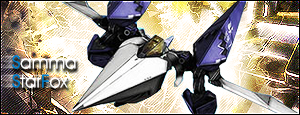
Latest Sig ~ Samma
in Graphics, Design & Animation
Posted · Report reply
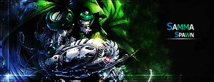
dr doom... not really cuz hes not only got 2 eyes... he doesnt have a gun... neways hes one of Spawns rivals...
and i havent been repeating the same style... this one's a smudge... the one b4 this one was a pinlight type random thing that kinda looks like clone stamp even though it isnt... and the ones before that were pretty much c4d stuff...