sylenzednuke 0 Report post Posted August 29, 2006 Hi! Guys, I was thinking of an banner for my web-site hosted at Xisto which is still under its preliminary stages and this is the banner I made. It has elements of technology, grunge and rebellous authority. Please rate it on a scale of 10 and a big thanks goes to snowspider from StaticART for giving me some guidelines and helping me alot with the banner. http://forums.xisto.com/no_longer_exists/404.png Share this post Link to post Share on other sites
bhavesh 0 Report post Posted August 29, 2006 I think it's a good banner, nice work Falak. Some suggestion for you. It has elements of technology, grunge and rebellous authority. Technology part is missing in the banner.Right bottom corner is a bit darker.I will rate it 7/10. Share this post Link to post Share on other sites
MIGUE2k7 0 Report post Posted August 30, 2006 (edited) I really like the kind of text you put there, and the background just owns!But of course.. like on every artwork.. there is always some mistakes.. but if you say your banner is on preliminary stages.. its ok.First i would suggest a wider but thinner size of it (i mean, width from about 700 and height from about 120 to 140).. cause most of the banners i've seen are thin.Aslo if it is a banner add there some othet text so it wont look to plain and the time of seeing the text (maybe your site address, site name of slogan)But everything else is good for me. 7/10 (keep the good work ) Edited August 30, 2006 by MIGUE2k7 (see edit history) Share this post Link to post Share on other sites
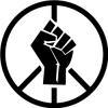
biscuitrat 0 Report post Posted August 30, 2006 (edited) I don't like the outer glow - it's very noobish. In addition, the color tones don't seem to match up. You have dark text on a muted background - which would work, were it not for the bullet. If you added a filter to the bullet/color overlay, or something to make it less deviant from the over-all schema, it would look a great deal better. Now for the text: Can't say I like the style nor the wording. What part of this implies a bullet to one's head, figuratively or literally? I see a fist jutting up out of the background - something reminiscent of protest or victory, which works well with the grunge where the text doesn't. It looks like you used a variation of Courier to get the job done - it looks all right, but if you're going to do grunge, do it all the way. Use a grungy font - Courier is primarily regarded as a techy font, being monospace and all that. And the background: It's pretty good, I think, except for that whitish line jutting to the right of the fist. It seems almost out of place. I see you had fun with random brushes - try not to use too many of them. Try to stay within your theme or it'll start to look really messy. Again, the bullet doesn't seem to fit. Its current position in the middle of the text makes the text a little hard to read. Ideally, the bullet would be somewhere more prominent so people would see how the background correlated to the text it's accenting - since that's essentially what an image signature is. Notes: Migue was right about it being a little too short, but it really all depends on how big your website's layout is going to be. For the moment, stay with the style you've chosen. In conclusion, I'll probably give you a 5/10 - good work, keep it up, and sorry for the commentary! Edited August 30, 2006 by biscuitrat (see edit history) Share this post Link to post Share on other sites
sylenzednuke 0 Report post Posted August 30, 2006 Well thanks for your comments biscuitrat and MIGUE2k7 the thing is that this was my first try to create a banner and I have never done any banners before this. I wanted to blend the elements of technology, grunge and authority but I think I have failed to do so.Anyways, I will keep certain things in mind, the next time I do such kind of banners but I think for my first try, it if good.Next time I will try to get atleast an 8/10 from everybody. :DOnce again, thanks for all of your comments on my banner... Share this post Link to post Share on other sites
Dawiss 0 Report post Posted August 30, 2006 well it looks impressive and have a good potential lol but there are lots of work on it needed more.. Right side is more emptyer then left side that yellow thing show that.. text need some work - if you want to look like the text is moving then you need to strech whole text not only 2 or 3 words.. scan lines need lower the opacity and add contrast to sig and make it bit darker.. and I thik quality of the sig is low.. Share this post Link to post Share on other sites
Dagoth Nereviar 0 Report post Posted August 30, 2006 It looks random, cool and grungey :DIf it's one of your first, then you're gunna become an awesome sig maker :D8/10 (Coz it should be green ) Share this post Link to post Share on other sites
pixieloo 0 Report post Posted August 30, 2006 I think it looks good. I think it would be better if it were a little thinner, because there's space above the bullet, and a thinner banner will bring out the text a bit more. But it's good - 9/10 Share this post Link to post Share on other sites