

Frozen
-
Content Count
204 -
Joined
-
Last visited
Posts posted by Frozen
-
-
Heh your mom's a man!
 Jus playin. Moonwitch should be pmed so he knows about the gift!
-
Thanks man =] I really appreciate it
-
I will do this today sometime. If not today, tomorrow for sure.<3
-
Lol. Calm down there john boy -_-He simply overlooked it im sure, was so happy im making him one ;P
-
I'll make one, as well. But will use counterstrike as the render
-
Feel free to poke fun at it. I've been busy creating wallpapers and such. Feel free to rate those too
http://m-e-c-a.deviantart.com/
Thanks.
-
Phyre:3Luki:1Johnny:1Rest of the contestants are without a vote.
-
Sorry dude, But I don't like this at all. It seems rushed, and seems to plain. The pixel text needs work, as well as the background coloring.
-
Luki Gmv. I love everything about it, I don't see any flaws o.O
-
Looks good, but the render looks a bit funky o.OPLAY THAT FUNKY MUSIC WHITE BOY
-
I would say add more depth, contrast, color, and Don't blend the render so much man. We can really work of this background and stuff though
-
Too wide. Seems more of a banner because of the little heighth and big width.Sorry bro.
-
Sorry bout the spelling error, Phrye feel free to I M me about the filters sigs, not hard at all to make
-
I swear Johnny has a blue fetish -.-Not bad guys
-
Add Contrast, correct the spelling, and add more depth, and it's a good sig.nice work man.
-
2-1.True Fusion gmv, I know how much more work was put into it, and I'm pretty sure that other sig could be put together without photoshop.
-
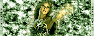
Defaults Only. Good luck all.
-
The sigs all are too similar, and have no depth. Sorry bro, but I'm not liking these. I do however, like the predator one. Add more color and depth, and you have a nice sig.
-
I don't think it's bad at all. Johnny you seem to be somewhat obssessed with blue :lol:Good lord -_-Try to add more than 1 color to your sigs
-
I'm not much of a fan of his text. Try something else.For a nice, easy feel, do this:Make the text white, under the color balance layer, and go to Layer>Layer Style>Drop Shadow, Leave settings alone, then go to Inner Shadow, and lower it from 75-40% and finally go to Bevell and Emboss>Size 5-0 -_-It should blend perfectly in with the background of the sig, as well as with the color of the background.
-
Looks good Big Jo. Do I not see text? Maybe it's not finished? o.OGood effect so far, but finish it strong
-
Good battle dude, rematch any time!
-
Yes sir. Thanks man, I appreciate all the warm comments
-
Looks good Moonwitch, Unlike guangdian I see the point intended, and it looks good to me
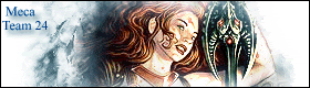
Made This Sig For A Girl... that i know
in Graphics, Design & Animation
Posted · Report reply
Well, that is one interesting hat she is wearing -_-Now that I'm done looking at the hat, not bad. A bit simple and easy, but not bad.