

Frozen
-
Content Count
204 -
Joined
-
Last visited
Posts posted by Frozen
-
-
Are you looking for a Banner or a Signature?A signature is usually small, and a banner usually goes up top of the forums.
-
Frozen: Your sigs seem to be getting worse in my opinion since you started doing defaults and whatever. Your background is extremely busy and doesn't work too well with the render (you've gotta pick colors from the render). Also, the text is scattered all over the place :/ ROFLROFLROFLROFL
Notice from Johnny:Frozen, no posting other than votes here. And she's entitled to her opinion. And that was pretty much a spam post. Don't make me warn you bro. -
Why didn't you rate mine? :)I vote johnny, love uniqueness.
-
Thanks man, I appreciate it man

-
Lol. I'm mostly into team 24 degrees, and here. both straight up pwn
-
Did you tell him you'd ban him if he didn't make it blue
-
=O Thanks dude, and I would have to say : In all honesty, me or johnny. The way people vote now a days is biased, and me and johnny are active everywhere
-
This is considered a wallpaper with text :)What you are wearing is a sig. Make them like that

-
Not at all :DAlright well, i'll start on this soon
-
Well I guess I'm the only one not liking your sigs
-
If you had to choose one designer, as an overall designer, to represent Trap 17, who would it be?Meaning, sigs, wallpapers, templates, tutorials, everything.Who would you pick?
-
To be honest with you, nothing eye catching imo. The first one, the text looks bad, and the film strip seems like an image you didn't create. Sorry if i'm wrong.
-
I will battle you, as in, I don't like your cockyness. Give me time to make a nice one, so you my friend, can loose.
-
Lol, I didn't know we had to be great at these things
-
Well, update then :)Not bad, but the render is poorly chosen.
-
Not bad, but you need more render effects and do add more color than only blue -.-
-
Thanks. Wow, I'm only c4d and Terragen designer? o.O that's weird lol
-
Looks good, but I've seen better from you. The unneeded splurges of white are kind of a dislike, and I don't like Scanlines over text. Maybe erase that, and it'll be better.
-
Bump, would anyone like to take this? unlike gamerenders you don't loose credits or anything like that
-
Thanks dude, Damann, I've never seen your work before bro, any good?
-
-
Gracias dude, Gracias. I forget who exactly requested this tut, but Someone here did, and so I did it, being a generous dude

-
Omg. Dude, are you blind? That has to be the ugliest sig you've made, in a long time.Bah just playing, I love it. Maybe lower the scanlines, but looks hawt
-
Lmao. But what I'm saying is, when I first learned how to do those borders you have, people would be like OMG WTF IS THAT GG BBQ HAX!lol
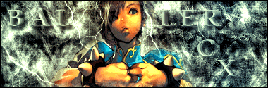
First Try At A Sig
in Graphics, Design & Animation
Posted · Report reply
Looks good man. Work on your pixel text and your background a bit more, but good job