

Se?or Maniac
-
Content Count
287 -
Joined
-
Last visited
Posts posted by Se?or Maniac
-
-
Se?or Maniac:

Vs.
Avalon:
Best out of 7.
Good Luck.
-
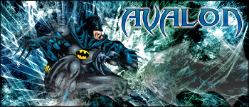
Size: 400 by 150 to 350 by 150Render: Must include some ford of batman render. New or old. IE: logo or person.Brushing: FreestyleText: Must include your name.
-
Real Name (optional):
Prefer not to.
MSN:
Senormaniac@hotmail.com
AIM:
senormaniac
Email:
Senormaniac@hotmail.com
Experience in graphics:
About 1 year on and off working on sigs and other images w/ photoshop.
Areas of expertise:
Sigmaking
Other graphics sites worked at(optional):
N/A
Past positions at other graphics sites(optional):
N/A
Current positions at other graphics sites(optional):
N/A
How much you can be on each day:
I am on everyday.
How many templates/sigs/resources could you make a week:
Not sure.
Examples of your work:
Tech:
Pop-out:
Grunge:
Abstract:
-
Version 1
Version 2
Yeah
-
The red color of the outside is just to bright and is a distraction. It seems that there is no brushing or filters in the background to spice it up, and also has colors that are clashing imo. The render consumes alot of the sig and no blending. Last the font does not match well. Especially with the red stroke that you added to it. Kudos though because it is a breakaway, from the traditional four sided box, that people use.
-
I actually spent a couple hours on this one. I kept looking for bushes to go with it but I could not find anything.
-
Made for sig of the week.
Comments
-
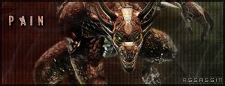
Heres my entry
-
My entry for Sig of the week.
-
Here is my entry.
-
It is looking better. You worked on working for colors into the background. Yeah finding the right font is probably the gardest thing for every designer. The render still needs to be blended a little. If you go Layer > Layer Style > Blending options. There is a whole resource for blending and all sorts of other effects that you might want to use for your image, text, and anything else that you might want to add some effects to. Keep up the good work man.
-
Zythrix basically summed it up. Other things that need to be done though are this. Try to create a sense of depth. This can be done by dropshadows or moving layers around.
-
This sig is alright. Afew things need to be worked on though.1. The font: the font is very important selection and, the one that you selected here is not cutting it in my opinion.2. Brush selection: From the looks of it, it looks like you did the whole thing with filters, right?3. Add some color to the sig. A simple one color background is not that appealing. Add some color gradient.4. The last thing that I have to add is render blending. Try to blend the renderinto the sig a little more. Move the layers around so that it looks like there is depth and not just a picture slapped on top.Other things congrats on the pop-out. Mine first pop-out was awfall. It scared little children and gave people the plague.
-
Yeah another thanks. I dhave not seen this one either. I guess thtat it was that whole period where I decided to do nothing.
-
Wow thanks. It has been a while but i accept it. LOL wow.
-
Just a reminder to you two that, as unbelievable as it may sound to you, even Saint Michael was a beginner once. Practice, practice, practice, and it'll come with more practice. Did I mention that you might have to practice once in a while?
That is funny. He still is a beginner. Jk. Anyways like they said, the people that are good here like Johnny and the rest have had alot of practice using the programs and what not. If you want to get good I suggest that you get photoshop. After a while the interface gets very easy to understand. Also listen to the comments that the people have to say. That is how I am steadily trying to improve.
-
What I meant was the fact that I was a different style for me than what I usually do. Yeah and the text was just a random pick also.
-
Yeah it looks good. I agree with Johnny to on the fact that the render could have use a drop shadow.Also don't worry Albus Dumbledore. I don't think i will fair good in the SOTW also.
-
I have worked in ps for sometime and have not attempted a tech sig till now.
-
heres mine
I am sorry, but you can not use the image because of the size. The image must be 125x by 350.
-
I have been trying to break away from the whole hue/saturation thing and try to work on my text and blending of the render better.
Atleast I stayed away from the ctrl+u this time. lol
-
-
I wish that I was good at this. I am at the very bottom of the list. Visit Sites like http://www.gamerenders.com/forum/ Or http://pizzapizza.io/ . They are alot better than me. Or you could just look at Johnny or any of the other members here.
-
1.
2.
Number 2 I had so Much trouble choosing a font for and I still do not think that it is good. But what can you say.
Sotw #31 Entries Entries for SOTW 31
in Graphics, Design & Animation
Posted · Report reply
My entry: