mattmgill 0 Report post Posted June 21, 2007 These are some WoW sigs I cooked up whilst revising for my exams. Could you please tell me how I can improve each and the which parts are good in all 3, they are all similar but state which parts from each should be used to make a better versio nfrom all 3. hope that made sense. http://forums.xisto.com/no_longer_exists/404.png http://forums.xisto.com/no_longer_exists/404.png http://forums.xisto.com/no_longer_exists/404.png Thanks in advance. Share this post Link to post Share on other sites
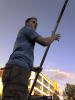
Ridwan sameer 0 Report post Posted June 21, 2007 OMG.I bet these were done in fireworks, they are excellent for fireworks stuff. i say the 2nd one is the best from the all. Because the 1st one is consistance of the main part of the render at full visibility and that doesn;t do wonders for me. the 3rd one consists of two renders overlapping each other and both having their fair amounts of visibility causing an upsetin the total outcome. What i mean is it doesn't look nice putting one render on top of the other.Now the 2nd is great because the bear isn't a main part of the renderv ( Although it is consisted in the render. The man stals everything )But the bear is great .Grat stuff mattmgill hope to see more Share this post Link to post Share on other sites
truefusion 3 Report post Posted June 22, 2007 Not really sure what you made these in, but if Ridwan is correct, then that is very good work for Fireworks! I believe the first one is the best out of all them. It has better clarity than the others, and text looks better in it. I can't suggest much, for i am ignorant of what program you used to make these.The second one should have different text placement. The third one should have text like the others, but the bear and bearded dude mixture with the fade doesn't help the sig much, in my opinion. Share this post Link to post Share on other sites
Ridwan sameer 0 Report post Posted June 22, 2007 Not really sure what you made these in, but if Ridwan is correct, then that is very good work for Fireworks! I believe the first one is the best out of all them. It has better clarity than the others, and text looks better in it. I can't suggest much, for i am ignorant of what program you used to make these.The second one should have different text placement. The third one should have text like the others, but the bear and bearded dude mixture with the fade doesn't help the sig much, in my opinion. HEy true he does use fireworks. Have you seen his iceman sig? wellanyway my first post waswrong i agree with true fusion on the best one being the first, I didn't see the text in any of them and as both me and truefusion said the man and bear fade ixture isn't good. well anyway keep up the good work and hope you can become better.Regards Share this post Link to post Share on other sites
mattmgill 0 Report post Posted June 22, 2007 Thanks you guys, I did make these in fireworks. Also anymore feedback from anyone would be great. Share this post Link to post Share on other sites