FMjets13
-
Content Count
1 -
Joined
-
Last visited
Posts posted by FMjets13
-
-
-
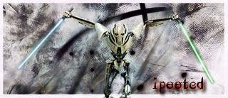
my outcome
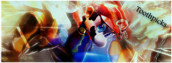 not that good thou
 -
look at my sig the 1 px black line thats a border it makes it look much better
-
Its real good but i dont like that fog effect and u should have added a border
-
 confident about this sig but works better on a darker forum
 so i will probably using this

challenger can decide thou
-
Newest-Oldest
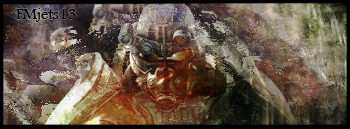


New Sig Please give feedback
in Graphics, Design & Animation
Posted · Edited by FMjets13 (see edit history) · Report reply
The border is on its just the forum and yeah i messed up on the text
also give feedback on this 1 plz