

Bkag
-
Content Count
322 -
Joined
-
Last visited
Posts posted by Bkag
-
-
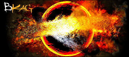
I dont perticullaly like the first one, looks too simple, but the last two I love, first gets 6.5 and last two get 9
-
My overall rating would be a 4, the text on alot of them needs some work, some of them have some slight blending issues but apart from that they are great

-
Wow thanks for all the comments
Im still improving every time i make a sig, but Im so busy atm that Im only doing one or two sigs per week -
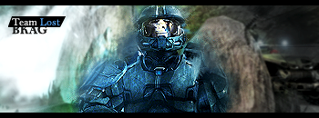
I haven't been on here for a long time
but here is what I have been getting up to 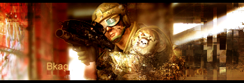

-
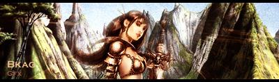
Very nice, do you battle on NSL or on PR?The starvation one is good, good blending and good text
-
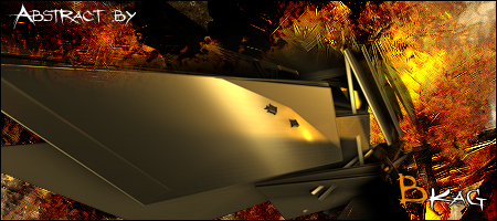
Hey, wait a second, someone else has done that exact animation :s on planetrenders.net :S^_^EDIT Found the thread and its you
 lol
lol -
Thanks, I would show you my most recent one, but it is secrete  until January 1st
-
I can do basic animation, some photomanip work, im pretty good at userbars and also photo retouching / photoshopping
When i say basic animation i mean basic, like this

-
Lol, Here is my entry, I promise i started before i saw G.O.E's entry, i didn't knick his render
Ill be updating it because i don't like it very much right now

-
So you think im at a good enough standard now to get in?
Lol, I didn't think I was yet -
GOE, Thanks, I just noticed your from Mancheser
Im a from Huddersfeild, anyway, yeah, you would think that text is the simplest thing and the easiest thing but for me it is sometimes the hardest. I can sometimes get it right but alot of the time not Ill aplly to the gfx team once I do a few more on photoshop (only done about 20 on photoshop (of those about 10 are for myself ))Migue, I wouldent say im better than you, I would never be able to do that sig you recently made. That looks like a good site, ill try some out this afternoon
And as promised i updated the text, and put abit more color in the render
V1

V2

-
Thanks Truefusion, i also have just joined a team (AlphaZeta) so am going to be working on some sigs there. Im still trying to get my text skills up, sometimes i have the eye for it, most of the time i don't. Ill try and improve enough to apply for graffics team
Ill be doing quite a few over the next 3 weeks, christmas holidays -
Thanks man
I forgot to work on that text, Im photoshopped out right now, im guna do it tommorow -
I would try coloring the text by using colors from the render, test if having the text the color of the face of the render looks any good etc... (I expect (the face color) not, but maybe
) -
I think it is pretty good, personally I don't like multi render sigs, because it kinda gets rid of the focal point or makes you not really know where to be looking but this one came out pretty well. But Im not too fond on the text, it kinda draws attention to itself somewhat too much. I'm not sure how i would do the text
(I suck at text placement and design) -
Lol, No problem keri-j, you make a good point, i have edited the original post
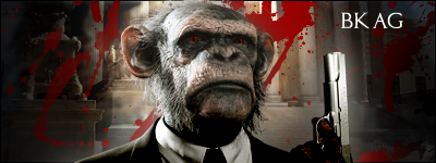
The one with the chimp was pretty fun to make, just thought it was a really cool render and i wanted to make a sig outof it
Update: today i have learnt some new techniques
and here are some requests i fulfilled (This one, the requestee asked for it to have alot of white :S )


-
Lol, Thanks, here is another one i did today
V1
V2
-
Merry Christmas, I love that render too
-
Hmm, i don't know about the glass effect, but i like this sig, its mono but still not boring, and i love the text. One suggestion that i would make would be to turn down the opacity of the glow on the render abit
But apart from that its real good -
Sorry yeah the link changed when i reuploaded it to photobucket :oops: i have fixed it now
Oh and that was my first ever pixel stretch Another im working on
-
Yeah, I should do some more brushing, on the first one all i used was smudge and 100px soft brush. I use some brushing on my next ones
Here is another one i did yesterday, not for me but on request:P
-
Mine also goes to teecee, nice, clean and cool

rvalkass:0Plenoptic:0
TeeCee:2
Mich:0
-
Yeah, mine does suck somewhat, I just found that size really hard to work with, since my sigs are usually reallly tall
 , minimum i use is about 125px
 -
Well
no point posting them in the threadbecause they are in my sig, so what do you think?Here they are

Logo Request Bkag
in Graphics, Design & Animation
Posted · Edited by Bkag (see edit history) · Report reply
Accidentally submitted before I added this in moderators, sorry.
Size: 350x350
Theme: Hip Hop
Render: Your decision
Color: Any
Text: Dj Trak Trix
Other effects: Any
Im looking for a logo along the lines of these ones:
Thanks in advance,
Ben