

MaRocker
-
Content Count
9 -
Joined
-
Last visited
Posts posted by MaRocker
-
-
hmmm....I think you should place that silver thing more to the center. And maybe you can add a border to the sig and to the text:the ladies from hell, 125 years, 2006
-
i don't see anything :S
-
I love it!
-
Albus: 1Zabb: 4I vote for zabb,the background of albus' background isn't that spectacular. And the animation doesn't seem to be smooth. What i also don't like is the place he put his nickname.Ik like zabb's a lot because of the color he used, the feeling i get when i see the sig, the beautiful animation and the border.
-
Thanx a lot!
-
-
Hey y'all,
I entrered a converse allstar contest where i can win a 30GiG-ipod! I made an animated picture (it's not that good, but it is original).
It looked like i had the most votes, so I really tought i'd win. But now it seems that everybody is getting more votes than me

 .
.So would you be so kind to vote for me?

I would really appreciate it.
http://forums.xisto.com/no_longer_exists/
and vote for: m armani
Thanx!,
Mo
-
Hey, this is my first time enterning a contest on this site. Can you tell me whether this sig is right?

-
Thanks for the compliments. I'm glad you all like my tut.
Very Nicely done.Hey, was it you that did the favicon for me about a month ago? I thank you for that if it was you, and welcome back.
Yes, i was the one who made you that favicon
-
Thanx a lot
-
How to make this
I made a videotut:
Mirror1: http://forums.xisto.com/no_longer_exists/
mirror2: http://forums.xisto.com/no_longer_exists/
mirror3: http://forums.xisto.com/no_longer_exists/
mirror4: http://ww8.filecache.de/ (choose: Datei jetzt herunterladen)
-
A 7,5. I do like the colors
-
It looks allright
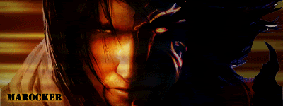
Sig#013, Sig#014, Sig#016 My Latest Sigs
in Graphics, Design & Animation
Posted · Report reply
Hey, manson is cool :lol:I like the sigs a lot, except for the text: "just a kiss"I think you should use a more romantic font and lower the opacity.